

In Bulma, a theme is a collection of CSS variables.
Bulma comes with 2 themes:
light.scss(required)dark.scss(optional)
The default themes
Because Bulma requires a default value for all CSS variables, it comes with a default light theme located at /sass/themes/light.scss.
It also comes with a dark theme located at /sass/themes/dark.scss.
The file /sass/themes/_index.scss takes care of including both themes, each in two ways:
- with the
@media (prefers-color-scheme: $name)media query - with an HTML attribute
[data-theme=$name]and CSS class.theme-$nameselector
The only difference is that the light theme is also defined at the top-level: :root (equivalent to the html element, the ancestor of all HTML elements on a webpage). This ensures that a default value is set for all CSS variables.
The CSS output of that theme resembles the following:
:root {
    /* CSS Variables */
}

@media (prefers-color-scheme: light) {
  :root {
    /* CSS Variables */
  }
}

@media (prefers-color-scheme: dark) {
  :root {
    /* CSS Variables */
  }
}

[data-theme=light],
.theme-light {
  /* CSS Variables */
}

[data-theme=dark],
.theme-dark {
  /* CSS Variables */
}
Creating a custom theme
Creating a theme is essentially setting your own CSS variables. A custom theme requires:
- a name like
sunrise - a scope like
:root,[data-theme=sunrise],.theme-sunriseor all three - a set of CSS variables and their new value
Customizing in the browser
If you set your CSS variables under the :root scope, you are overwriting Bulma’s default theme. This can be done by with Sass or CSS.
To test out the CSS method, simply follow these steps:
Open your browser inspector
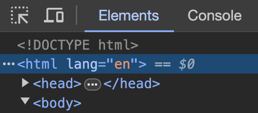
Select the html element
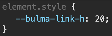
Insert a new value for the --bulma-link-h variable (the hue of the link color)
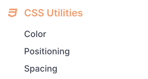
Notice how the CSS Helpers section in the side menu changes color

