

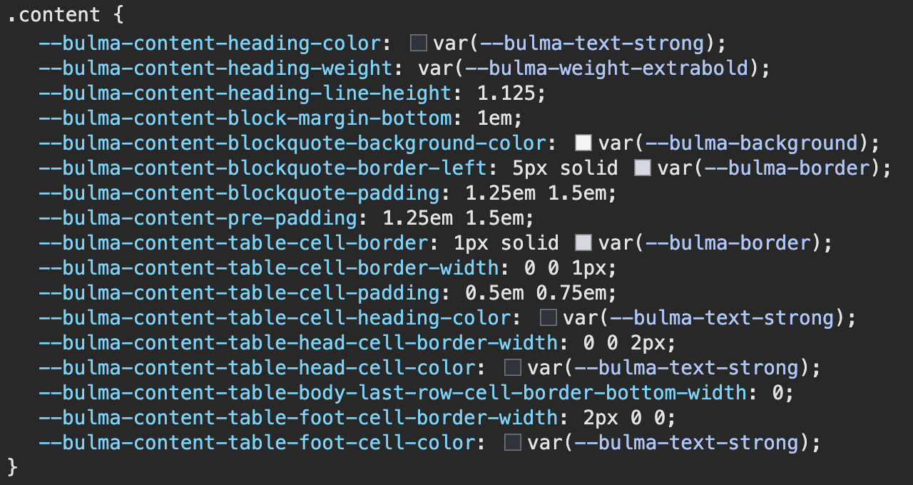
All Bulma components are styled using CSS Variables (which are also called CSS custom properties). Read more about them on the MDN Reference.
For example, here is how the .title element is styled:
.title {
  color: var(--bulma-title-color);
  font-size: var(--bulma-title-size);
  font-weight: var(--bulma-title-weight);
  line-height: var(--bulma-title-line-height);
}
Scope
Bulma CSS variables are either defined:
- at the global scope
:root - at the component scope, like
.button
CSS Variables defined at a more specific scope (like .button) will override the ones defined at a more global scope.
:root {
  /* Default global value */
  --bulma-size-medium: 1.25rem;
}

.button {
  /* Overrides the global value */
  --bulma-size-medium: 1.5rem;
}
Prefix
All Bulma CSS variables are prefixed with bulma- (including the dash). You will notice theme when inspecting a webpage:
This prefix can be changed by setting the $cssvars-prefix Sass variable:
@use "bulma/sass" with (
  $cssvars-prefix: "my-prefix-"
);
Themes
The global CSS variables defined at the :root level are what defines a Bulma theme. Think of a theme as simply a collection of CSS variables.

